

Dagat
Filipino Inspired Canned Fish
Dagot is a vibrant line of tinned fish inspired by local Filipino aquatic or commonly eaten canned fishes that comprise a large part of my Filipino family’s diet.
The color palette is inspired by the vivid colors found in urban Filipino architecture, textiles, and artworks. The tin aims to introduce a whimsical approach to tinned fish design and highlight Filipino culture.
illustration | Product design


Concept

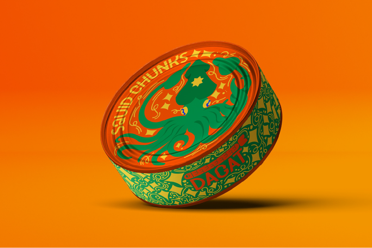
DAGAT LOGO
Explored a variety of potential fish that showed promise in becoming a log. Bassing the fish based of the commonality of it appearing in Filipino waters or a fish that stands to be visually stunning and eye catching.
Ironically setting for a close up sardin after various exploration as it is the most common canned fish consumed by Filipinos and within plotted design fit prefectly with the logo title DAGAT.
INITIAL CONCEPT
Various fish and sea life had the opportunity to be featured on the cans within my mock. The goal was to aim for the most commonly eaten local Fishes in the Philippines and translate them into tin fish for the mock. In theory, Dagat would strive to canned a variety of fish not usually packaged in mainstream but catering to a more Filipino lifestyle and diet.
This is especially so for products like crab eggs, sardines, squid, etc. Playing on different potential tin sizes to help the illustrations combine with the can rather than just printed on it.

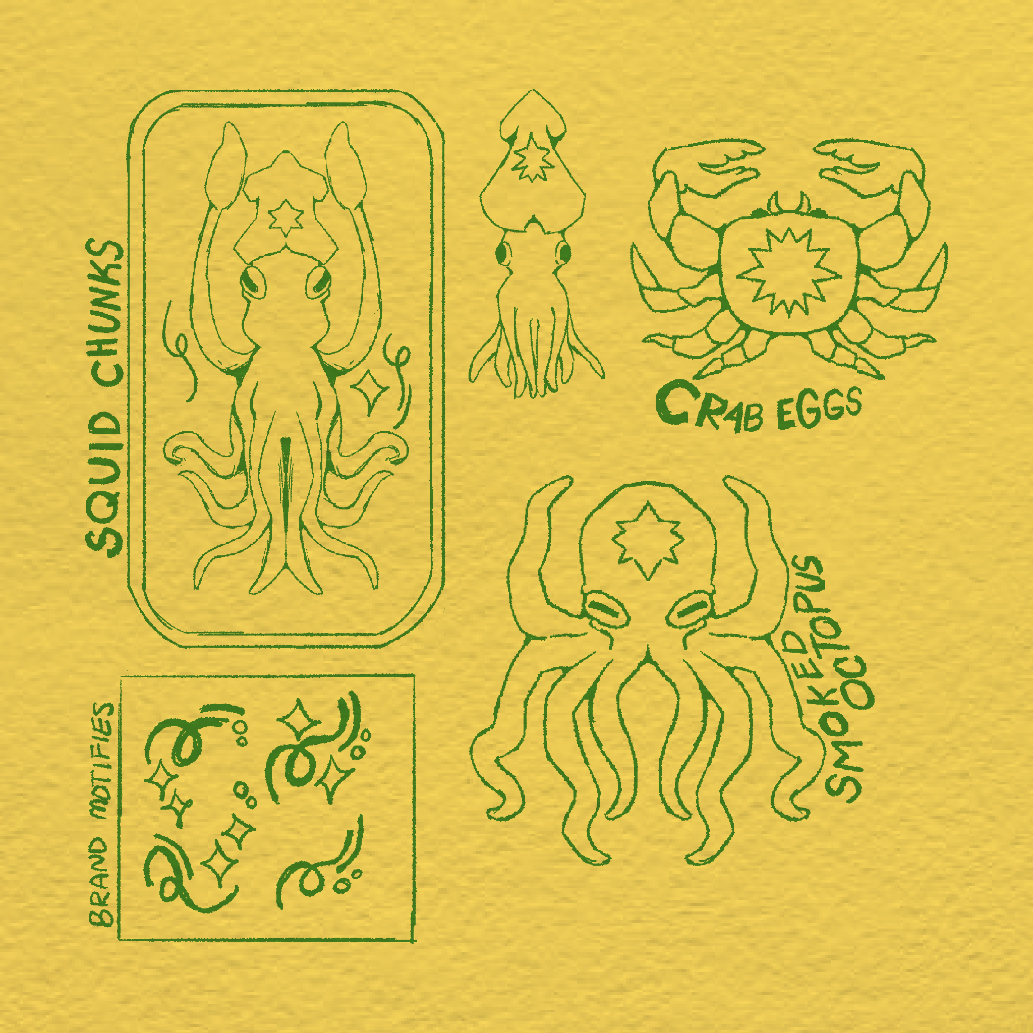
ROUND TIN SKETCHES
Here are some illustrations during the final sketching process when ideation was ready to head to the final. The round tin due to its flexibility and unique shape that doesn’t follow a box approach like most tin fish, I wanted to play with the area and body form of the illustration which animals like squids, crabs, and octopuses were most versatile and malleable.
The round cans were the first to reach the final then the rectangle tins were added later in the rotation.

BOX TIN SKETCHES
The yellow thins followed the most basic format of tin fish. So I wanted to demonstrate variety between all the tins in their illustration beside their color palette.
I played with shape and form through the goofy illustration of each fish tin. Each is unique and visually interesting.
Featured

Geo

Traversal

holiday box
